Describing Graphs
Below are some examples of how to describe different graphs. Remember - you should be able to say something interesting about every graph you make.
Pie Charts
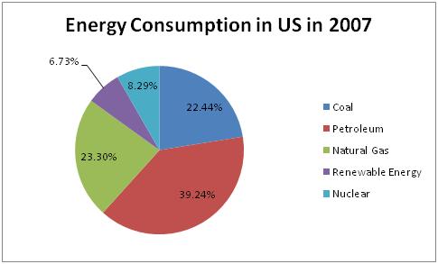
This pie chart shows the percentages of different types of energy consumed in the US in 2007. Most of our energy, 39.24%, came from petroleum. Our next largest source of energy is a tie between coal and nuclear energy. It is interesting to note that renewable energy, which is healthier for the environment and sustainable, accounts for the smallest percent of our consumption.
Bar Charts
(Note: The two things we talk about
are the differences between the years, and the differences among the
categories.)
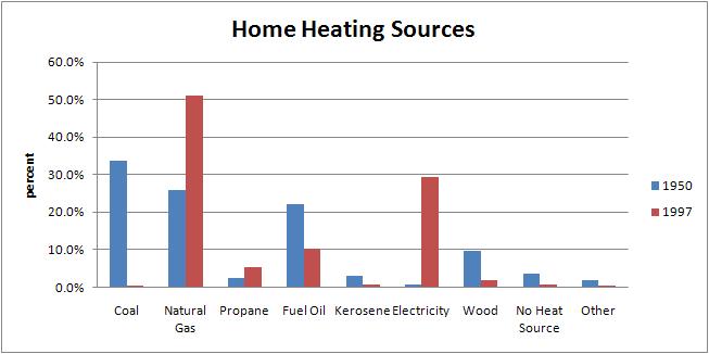
This chart shows the home heating sources in 1950 and 1997. In 1950 coal, natural gas, and fuel oil accounted for the highest percentage of home heating sources. By 1997, use of natural gas had soared to become a source for over 50% of home heating. At the same time, use of coal and fuel oil decreased significantly. Electricity grew significantly between the two years as well, accounting for some of the heating that had previously been generated by coal and fuel oil. It is interesting to note that natural gas, electricity, and propane are the only sources that saw an increase between 1950 and 1997. This graph shows that in both years people were heavily dependent on non-renewable sources of energy for their home heating needs.
XY Graph
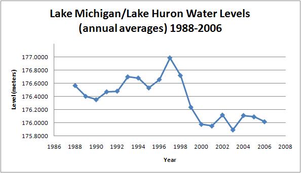
This graph shows Lake Michigan/Lake Huron Water levels (annual averages between
1988 and 2006. that after 1997 the average level of Lake Michigan decreased
significantly. The level started off in 1988 at 176.6 meters and remained
roughly constant until it spiked to 177 meters in 1997. After that it decreased
sharply until 2001, when it was approximately 176 meters. For the next
five years it slightly increased on average, however the most recent trend
suggests it will continue decreasing in the future.