Describing Graphs
Below are some examples of how to describe different graphs. Remember - you should be able to say something interesting about every graph you make. Don't ever make boring graphs!!
Pie Charts
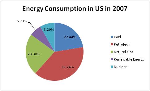
This pie chart shows the percentages of different types of energy consumed in the US in 2007. Most of our energy, 39.24%, came from petroleum. Our next largest source of energy is a tie between coal and nuclear energy. It is interesting to note that renewable energy, which is healthier for the environment and sustainable, accounts for the smallest percent of our consumption.
XY Graphs
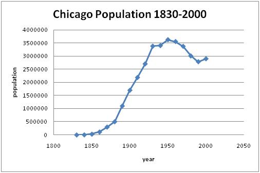
From 1830 to 1950 the population of Chicago increased significantly. The population peaked in 1950 at approximately 3.6 million people. Between 1950 and 1990 the population decreased steadily. Between 1990 and 2000 there was a slight increase back to approximately 2.9 million people.
Bar Charts
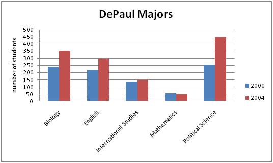
(Note: The two things we talk about
are the differences between the years, and the differences among the
categories.)
In both 2000 and 2004, Political Science had the highest number of students on
our graph, growing from 254 to 446 students. In both years also, Mathematics
had the least number of students. It actually decreased from 56 to 49. Out of
these majors, Political Science seems to be the most popular, while Mathematics
lags behind with a much smaller number of students.