 |
Quantitative Reasoning and Technological Literacy I |
|
|
|
Quantitative Reasoning and Technological Literacy I |
|
Please do the following at the beginning of every computer activity.
a. Open a new Word document.
b. Click on the Office Button in the upper left corner, then slide over "Save As". Appropriately save your document.
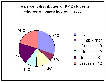
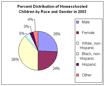
For Questions 1 - 4, please refer to Table 227.
1. Label the data in columns B-G as either relative or absolute.
Column B –
Column C –
Column D –
Column E –
Column F –
Column G –
2. Data in column D.
a. Show how to compute the numbers in column D from other data available in the table. Give one example showing your calculation.
b. What is the whole to which each of these percentages refer?
c. Is the data in column D appropriate pie chart data? Explain.
d. What type of chart would you use to graph the data in column D?
3. Data in column F.
a. Show how to compute the numbers in column F from other data available in the table. Give one example showing your calculation.
b. What is the whole to which the data in column F refers?
c. Why is the data in column F appropriate pie chart data?
d. Which other column could you use to make the same pie charts as column F?
4. For parts (a) and (b) make a graph that could have the given question as its title.
a. In 2003, what percent of each race was home schooled? Paste the chart into your Word document.
b. In 2003, what percent of all K-12 homeschooled students were white, black, Hispanic, or other? Paste the chart into your Word document.
c. Is graph (a) or graph (b) more interesting? Explain.
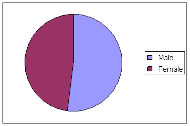
5. Common mistakes. Learn to find them now, so I won’t find them on your graphs later!
a. What is wrong with this pie chart?
b. What is wrong with this pie chart?
c. What is missing in this pie chart? (two things)
6. For questions 7 and 8, please refer to Table 247.
a. Why is the majority of the data in this table inappropriate for a pie graph? Explain this clearly for the data in cells D17-D20.
b. Fill in the blank: In 2003, 59.3% of _________________ used a computer at home.
7. Make multiple column graphs to show …
a. In 2003, what percent of males and what percent of females, used the computer at home to do various activities (word processing, internet, email, assignments, games)? Note: All of the categories - word processing, internet, email, assignments, games - should appear on the x-axis. Paste your graph into your Word document and make sure that it is labeled and titled correctly.
b. In 2003, what percent of each race used a computer at school and what percent used a computer at home? (Hint: Be mindful of how you set up your data. Usually it is better to have fewer categories in the legend.) Paste your graph into your Word document and make sure that it is labeled and titled correctly.
8. Open the file FatalWorkInjuries2009.xls, select tab titled, Fatal Work Injuries by Year, which contains the number of fatal work injuries and employment from 1992 through 2009. We are going to make a chart of this data and discuss the graph.
a. Make an XY scatterplot of the fatal work injuries data and be sure to choose the following graph type: Scatter with Straight Lines and Markers. Paste your effective graph in your Word document.
b. Write 1-2 sentences carefully describing the graph. What do you want your audience to know about the data you graphed?
c. Change the scale on the y-axis (right click on the y-axis and choose Format Axis...). Start at with a minimum of 4000 (click on "fixed" then change the number from 0 to 4000) and end with a maximum of 7000 (no change needed). Include the graph in your Word document.
d. Is the graph you created in part a) better than the graph created in part c) or is the graph in part c) better? Which graph is correct? When would you choose to adjust the scale. Provide written support for your answer.