- Select the data with the mouse. Generally speaking it is best to select only the data, not headers and labels. Excel sometimes handles the headers very nicely, but at other times it leads to confusion. You are safer to leave them out. (If the data you want to use is not in adjacent columns, select the first column of data, hold the control key and then select the other column of data.)
- Click on the "Chart Wizard" button at the top of the
screen:
 .
The icon depicts a chart, but it looks more like some books on a shelf. You will get
a menu that looks like:
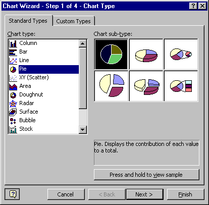
.
The icon depicts a chart, but it looks more like some books on a shelf. You will get
a menu that looks like:
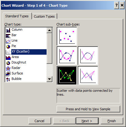
Choose the type "XY (Scatter)" and choose the "Scatter with data points connected by lines" subtype
.
Continue with the chart wizard by clicking on "Next >". Step 2 of the chart wizard gives you a preview of the graph. In this case it will be correct; however, if it is not, the problem often must be fixed by clicking on "Series" tab at the top of message box.
-
Continue onto step 3. Enter an appropriate title for the plot and appropriate labels for the x and y axes. Be sure to address the four W's when creating your title.
-
Finally, continue onto step 4. You will get a message box that looks like:
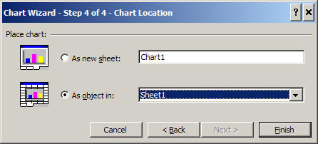
You are presented with two choices. You can choose to place your plot as an object on your worksheet or as a new sheet of its own. Both of these choices are useful. Placing on your worksheet makes it easier to resize the plot and make it an appropriate size for transferal to a Word document. Making the plot a new sheet makes the plot fill the screen which is useful for studying the plot and for making presentations. Today, place the chart as an object in Sheet 1.
Adjust the dimensions of the graph to make it the way you would like it. Remove the legend by clicking on it and pressing the delete button (Del). Generally speaking, a legend is not needed in a plot with only one data series. The purpose of a graph is to communicate to its intended audience. Make sure that your graph is clear and that a reader would understand what the graph is about.
-
Add the source of the data used to make the graph. To do this, look on the drawing toolbar (if you don't have the drawing toolbar on your screen, select it under the menu item View then choose Toolbar then Drawing). Select the Text Box tool (it looks like a piece of paper with an "A" on it). Draw your text box and type "Source: http://www.crh.noaa.gov".
Your graph should look something like this: