The Consumer Price Index: Measuring the Changing Value of Money
Think back a few years. How much did a gallon of gasoline cost then? A loaf of bread? A 10 inch sausage pizza? A movie ticket? Almost undoubtedly these items now cost more in dollar terms. There is a tendency for prices of most goods to increase, even goods that have no obvious quality improvement. This general price increase is called inflation, and it matters to us all, because unless our incomes rise to match the increases in the goods we need to live, we are not as well-off as we were before. Inflation is also critical to financial planning because $100 to be received in the future (e.g. at retirement) will undoubtedly be worth less than $100 received today. But the matter is complicated because prices fluctuate, quality varies, and buying patterns change.
How do we compare prices from the past to today's? How do we measure inflation? We will explore these questions in some depth. The answers turn out to be complex and in the center of significant current debate.
Table of Contents
1. An introduction to inflation
2. Index Numbers
3. The Consumer Price Index
4. Using the CPI
5. Inflation
6. Problems with the CPI
7. Exercises
Bibliography
1. An introduction to inflation
A good starting point is to look at some prices from the past. The table below show the average 1998 prices for a number of items. If you are using Internet Explorer 4 or 5, you can guess the average 1962 price for each. Then reveal the actual average price. (Netscape will show the prices.)
a1963 price. Sources for data: Malkiel, Burton G. A Random Walk Down Wall Street, New York: W. W. Norton and Company, 1999
If you are like me, your guesses were way off. In fact, even after going through the list, I really had no sense of what a dollar was worth in 1962. Furthermore, the prices did not go up consistently. The table below shows the percentage increases for each of these items:
| Item | Percentage Increase in Price |
| Hershey bar | 1180% |
| New York Times | 1100% |
| First class postage | 700% |
| Gasoline (gallon) | 284% |
| Hamburger (McDonald's double) | 861% |
| Chevrolet (full size) | 790% |
| Refrigerator freezer | 60% |
Hershey bars have really gone up, but refrigerator freezers haven't. It might be a little surprising to you that gasoline didn't go up nearly as fast as McDonald's hamburgers or cars. A complication comes to mind with the car data. It is fair to say that the newer car is better than the older one (safer, more dependable, more comfortable, less expensive to run and maintain ...) Thus it is not clear that the two cars are really comparable. Similarly, the refrigerator freezer one could buy in 1998 is probably significantly better than the 1962 model in terms of ease of use and efficiency, which means that the freezer is probably an even better buy (compared to the past) than it first looks.
What can we learn from this handful of items and prices? First, prices can and do change dramatically in relatively short periods, so much so that a price in the past virtually meaningless to us unless we compare it to other prices of the time. Second, prices of items do not go up consistently: some prices go up faster than others. Third, the items change over time so that it becomes difficult to compare prices because the items are not really comparable.
The tool that economists use to compare prices of the past and to measure inflation is called the consumer price index (CPI). The CPI is an example of an index number, and this section introduces index numbers in general.
An index number is a derived quantity that describes the ratio of a quantity and its value at a base period (or its values at a standard). The base period index is typically set to 100, so that percentage increases from the base period can be almost instantly inferred. Index numbers are most commonly used for time series, so looking at index numbers in that situation is a good place to start in learning about them.
Consider the average price of bread from 1980 to 1999:
| Year | Average Price of White Bread per pound (US City Average) |
1980 |
$0.51 |
1981 |
$0.53 |
1982 |
$0.53 |
1983 |
$0.54 |
1984 |
$0.54 |
1985 |
$0.55 |
1986 |
$0.56 |
1987 |
$0.55 |
1988 |
$0.61 |
1989 |
$0.67 |
1990 |
$0.69 |
1991 |
$0.71 |
1992 |
$0.75 |
1993 |
$0.75 |
1994 |
$0.76 |
1995 |
$0.79 |
1996 |
$0.88 |
1997 |
$0.87 |
1998 |
$0.86 |
1999 |
$0.89 |
To create a White Bread Index, we would choose a base year and set the index equal to 100 in that year. We use the very odd "equation" 1980=100 to signify our choice of 1980 as a base year:
| Year | Average Price of White Bread per pound (US City Average) | White Bread Index (1980=100) |
1980 |
$0.51 |
100 |
1981 |
$0.53 |
|
1982 |
$0.53 |
|
1983 |
$0.54 |
We want the index to reflect the ratio of bread prices from a given year to the price in 1980. Thus
| Price in 1981 | = | Index for 1981 |
| Price in 1980 | 100 |
or
| 0.53 | = | Index for 1981 |
| 0.51 | 100 |
or
| White Bread Index for 1981 | = | 0.53 | ·100 | = 103.9 |
| 0.51 |
Similarly, for 1982 we use the ratio back to 1980:
| Price in 1982 | = | Index for 1982 |
| Price in 1980 | 100 |
The completed index number table will look like:
| Year | Average Price of White Bread per pound (US City Average) | White Bread Index (1980=100) |
1980 |
$0.51 |
100.0 |
1981 |
$0.53 |
103.2 |
1982 |
$0.53 |
104.6 |
1983 |
$0.54 |
106.5 |
1984 |
$0.54 |
106.4 |
1985 |
$0.55 |
108.7 |
1986 |
$0.56 |
111.0 |
1987 |
$0.55 |
107.6 |
1988 |
$0.61 |
120.5 |
1989 |
$0.67 |
130.8 |
1990 |
$0.69 |
136.5 |
1991 |
$0.71 |
139.5 |
1992 |
$0.75 |
147.4 |
1993 |
$0.75 |
147.8 |
1994 |
$0.76 |
149.5 |
1995 |
$0.79 |
155.5 |
1996 |
$0.88 |
172.1 |
1997 |
$0.87 |
171.4 |
1998 |
$0.86 |
169.1 |
1999 |
$0.89 |
174.2 |
What is so useful about the index number table is that we can immediately read off the percentage change in the price from the base year. For example, in 1996, the index was 172.1. 172.1 is 72.1% higher than 100, so we can conclude that white bread prices are 72.1% higher in 1996 than in 1980. Similarly, in 1986, white prices were 11.0% higher. Furthermore, with the index numbers we can calculate the percentage change in price for any two years (even without knowing the actual prices. For example, the percentage change in the price from 1989 to 1999 is (174.2-130.8)/130.8 = 33.1%.
Another useful feature of indices is that if two indices have the same base year, we can readily make comparisons. For example, the price index for local telephone service (1980=100) in 1997 was 224.0. The price index for intrastate long distance telephone calls (1980=100) in 1997 was 110.2. We can conclude that local telephone rates rose much more than intrastate long distance rates: local rates rose by 124% while intrastate rates only rose 10.2%. (By the way, the index for interstate long distance calls (1980=100) in 1997 was 92.8; long distance telephone rates actually dropped from 1980 to 1997 by 7.2%.) However, we cannot compare indices from different base years. The price index for coffee (1990=100) in 1997 was 143.0; the price index for dairy products (1980=100) in 1997 was 160.1. We cannot conclude that dairy prices have risen faster than coffee prices. We can conclude that dairy prices rose 60.1% from 1980 to 1997, and coffee prices rose 43.0% from 1990 to 1997, but we have no information on dairy prices from 1990 to 1997. To make a comparison we would need a dairy price index for 1990 or a coffee price index for 1980.
Finally, note that one can make indices for other data series than price data series. One can make indices of sales, inventory levels, manufacturing activity. One can create complex measures that are weighted sums of a number of quantities and then index the resulting data series. For example, economists measure consumer confidence using a number of surveys administered monthly. The index created from this data series is a very important economic indicator. For example, consumer confidence (1985=100) stood at 61.6 in 1991. The index was down 38.4% from 1985. Note that in this situation, it is not really meaningful to say "consumer confidence fell by 38.4%"; we can only say the index fell by 38.4% indicating a drop in consumer confidence.
In the previous section, we saw how one can construct an individual price index. Such indices when based in the same year, make comparisons between prices straightforward. But how would one measure general inflation? The problem is that individual prices go up by differing percentages. Some prices even go down. The solution that the Bureau of Labor Statistics has adopted is called a fixed market basket index. We will describe this approach in this section.
First, a little history. There were a number of statistical studies of wages and prices in the late nineteenth and early twentieth centuries, but no systematic ones. In 1919, the Bureau of Labor Statistics started publishing "cost of living" indices for 32 large shipbuilding and industrial centers to assist in settling labor disputes. Workers were insisting on higher wages to offset the higher cost of living that resulted from World War I. Price indices could give some "objective" measure of the cost of living and facilitate bargaining between unions and managers. Since then the scope of the price indices published by the Bureau of Labor Statistics has greatly broadened. The indices continue to play an important role in labor negotiations but in addition are now used as escalation measures for entitlement programs such social security, food stamps, welfare, Medicaid, and Medicare. Over 2 million workers are covered by collective bargaining agreements which tie wages to the CPI. The index affects the income of almost 80 million people: 47.8 million Social Security beneficiaries, about 4.1 million military and Federal Civil Service retirees and survivors, and about 22.4 million food stamp recipients. Changes in the CPI also affect the cost of lunches for the 26.7 million children who eat lunch at school. Some private firms and individuals use the CPI to keep rents, royalties, alimony payments and child support payments in line with changing prices. Since 1985, the CPI has been used to adjust the Federal income tax structure to prevent inflation-induced increases in taxes. Economists and the financial markets use the indices as an economic indicator of the health of the economy. The monthly release of the indices leads to a swift and often dramatic reaction by the stock markets. Because they have become so important, they have become controversial and even politically charged. We will return to some of the current controversies in the next section.
In order to measure general price increases, the Bureau of Labor Statistics constructs an imaginary "market basket" of goods that an average family needs to lead an average life. The market basket includes specific items relating to housing, food, transportation, medical care, clothing, entertainment, education and communication. Currently, there are approximately 80,000 items in the "basket." Price data for these items is collected monthly from 22,500 specific outlets and 7,300 specific housing units in 44 urban areas. The prices for identical goods from the same area are averaged, and individual price indices are calculated for each item and geographic area. Finally the individual price indices are in essence summed up to create the "price" of the entire market basket. The final price is actually a weighted sum, the weights reflecting the proportion that the average family spends on various categories and population of the geographic area. The table below shows the current weightings for the broadest item categories:
| Category | Weighting |
| Housing | 39.6% |
| Transportation | 17.6% |
| Food | 16.3% |
| Entertainment | 6.1% |
| Medical Care | 5.6% |
| Education and Communication | 5.5% |
| Apparel and Upkeep | 4.9% |
| Other | 4.3% |
The CPI is the index number created from the "price" of the entire market basket. Currently, the base "year" for the CPI is 1982-84. This means that the average of the CPI over the three years 1982, 1983, and 1984 is set equal to 100.
Let us model the construction of the CPI with a simplified example. Our market basket will consist of one month's rent for a four room apartment (representing the housing category), one gallon of unleaded gasoline (transportation), one pound of white bread (food), one movie ticket (entertainment), one physician's visit (medical care), one ten minute long distance telephone call (communication), one pair of blue jeans (apparel), and one month's refuse collection (other). The following table gives some fictional prices for these items in the base year and in the next:
Category |
Item |
Price in Base Year |
Price in Next Year |
Housing |
Rent |
$500.00 |
$550.00 |
Transportation |
Gallon gasoline |
$1.11 |
$1.06 |
Food |
White bread |
$0.72 |
$0.73 |
Entertainment |
Movie ticket |
$7.00 |
$7.20 |
Medical Care |
Physician's visit |
$78.00 |
$79.00 |
Education and Communication |
Telephone call |
$1.20 |
$1.10 |
Apparel and Upkeep |
Blue jeans |
$32.00 |
$33.00 |
Other |
Refuse Collection |
$16.00 |
$16.50 |
Category |
Index Calculation |
Index for Category |
Weighting |
Housing |
550/500*100 |
110.0 |
39.6% |
Transportation |
1.06/1.11*100 |
95.5 |
17.6% |
Food |
0.73/0.72*100 |
101.4 |
16.3% |
Entertainment |
7.20/7.00*100 |
102.9 |
6.1% |
Medical Care |
79.00/78.00*100 |
101.3 |
5.6% |
Education and Communication |
1.10/1.20*100 |
91.7 |
5.5% |
Apparel and Upkeep |
33.00/32.00*100 |
103.1 |
4.9% |
Other |
16.50/16.00*100 |
103.1 |
4.3% |
Finally we take the weighted average of the indices for the categories:
110.0*39.6% + 95.5*17.6% + 101.4*16.3% + 102.9*6.1% + 101.3*5.6% + 91.7*5.5% + 103.1* 4.9% + 103.1* 4.3%
which yields 103.4.
The CPI created in this fashion is published monthly. The market basket and the list of outlets undergoes minor changes continually to adjust for products that change significantly or for outlets that close. The market basket undergoes a major revision roughly every ten years; currently, the market basket is based on the Consumer Expenditure Survey of 1993-95. The Bureau of Labor Statistics actually publishes two CPI's, the CPI-U (All Urban Consumers) and the CPI-W (Urban Wage Earners and Clerical Workers). The Bureau of Labor Statistics estimates that the CPI-U represents about 87% of the total US population; it is based on the expenditures of almost all urban residents including professionals, the self-employed, the poor, the unemployed, and retired persons. The spending patterns of rural dwellers, persons in the Armed Forces, and those in institutions (hospitals and prisons) are not included. The CPI-W is based on the expenditures of urban households more than half of whose income comes from clerical or wage occupations. The Bureau of Labor Statistics estimates that it represents about 32% of the US population. We will use the CPI-U exclusively since it is represents the experiences of a larger proportion of the population. Any reference to "CPI" will be to the CPI-U unless explicitly stated otherwise.
The Table below shows the official CPI since 1982. In this section we will explore how it is used.
Year |
CPI |
1982 |
96.5 |
1983 |
99.6 |
1984 |
103.9 |
1985 |
107.6 |
1986 |
109.6 |
1987 |
113.6 |
1988 |
118.3 |
1989 |
124.0 |
1990 |
130.7 |
1991 |
136.2 |
1992 |
140.3 |
1993 |
144.5 |
1994 |
148.2 |
1995 |
152.4 |
1996 |
156.9 |
1997 |
160.5 |
1998 |
163.0 |
First, we must ask, what do these numbers mean? A common misunderstanding is to think that the CPI number is the price of the market basket in a given year. This is incorrect. While the CPI number is derived from the price of the market basket, it is actually unitless; to be precise it is the ratio of the price of the market basket in a given year to the price in the base year multiplied by 100. However, the CPI can be thought of as the amount the average consumer would have to spend in a given year to buy the same basic goods and services that one would have to pay $100 for in the base period. For example, on average in 1998, one would have to spend $163.00 to buy the same goods and services that one would have paid $100 for in the base period 1982-84. Similarly, in 1994 one would have to spend $148.20 to buy the same goods and services that one would have paid $100 for in the base period 1982-84. Now since each CPI number is equivalent to $100 in the base period, each CPI number is equivalent to every other one: $163.00 in 1998 bought the same goods and services on average that would have cost $160.50 in 1997. $152.40 in 1995 bought the same goods and services on average as $124.00 did in 1990. We can say that 152.40 1995 dollars is equivalent to 124.00 1990 dollars.
The interpretation of the CPI in the last paragraph allows us to compare prices in two different years. For example the price of gasoline in 1990 was $1.16 per gallon on average. In 1997, it averaged $1.23. Was gasoline more expensive or less expensive in 1997? On the face of it, it seems that gas is more expensive in 1997. Economists refer to prices from a given year as nominal or current prices. Nominally, gas was more expensive in 1997. To compare the prices taking into account the changing value of money, we convert one of the prices to the same year as the other. Usually, we convert forward to the more recent year, but one could also convert back to the earlier year. In our example, we want to convert $1.16 1990 dollars to its equivalent in 1997 dollars. Now the CPI table tells us that
130.70 1990 dollars is equivalent to 160.50 1997 dollars.
We wish to know
1.16 1990 dollars is equivalent to ? 1997 dollars.
Perhaps the easiest way to solve this is to set up the proportionality
| 160.50 (1997 dollars) | = | x (1997 dollars) |
| 130.70 (1990 dollars) | 1.16 (1990 dollars) |
Solving this proportion (for example by multiplying both sides by 11.6), we find that $1.16 in 1990 was equivalent to $1.42 in 1997. In other words, when Americans paid $1.16 per gallon for gasoline in 1990, it was equivalent to someone paying $1.42 in 1997, which is considerably more that what they were actually paying in 1997. So gasoline was significantly cheaper in 1997 than it was in 1990. Economists say that the equivalent price in a different year is in real or constant dollars. In our example, economists will say that the price of gasoline in 1990 was $1.42 in constant 1997 dollars. The process of converting is often called converting to constant dollars.
(Another way to conceptualize the conversion to constant dollars is to focus on the meaning of the ratio of the CPI's, in the case of the example,
| 160.50 |
| 130.70 |
This ratio represents how many times more one 1990 dollar was worth in 1997. Multiplying the 1990 price $1.16 by this ratio yields how much $1.16 in 1990 was worth in 1997.)
Another use of the CPI is to convert an entire series of price to constant dollars. For example, consider the price of electricity from 1990 to 1998:
| Year | Average Cost of Electricity per kWh |
1990 |
$0.084 |
1991 |
$0.087 |
1992 |
$0.088 |
1993 |
$0.092 |
1994 |
$0.092 |
1995 |
$0.094 |
1996 |
$0.094 |
1997 |
$0.094 |
1998 |
$0.087 |
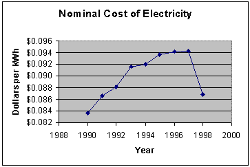
In graphical form, the data looks like:
The graphs shows the price of electricity rising from a minimum of 8.4¢ per kilowatt-hour in 1990 to its maximum in 1997 of 9.7¢. The price drops significantly in 1998 to 8.7¢ per kilowatt-hour. Since the value of the dollar decreased each year, this graph is not a realistic depiction of electricity costs over this period. To get a more accurate understanding, we convert the entire data series to constant 1998 dollars. The spreadsheet image below depicts the calculation. First one would paste in the CPI values (for convenience). Next one would fill a column with the nominal cost multiplied by the ratio of the CPI's involved.
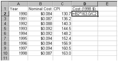
You might wonder why one doesn't use the formula =B2*C10/C2. This formula will not fill correctly, since C10 needs to be used again in each cell (not C11, C12, ...). Another correct formula for this cell is =B2*$C$10/C2, using an absolute cell reference for C10.
Here is the graph of electricity costs in constant 1998 dollars:
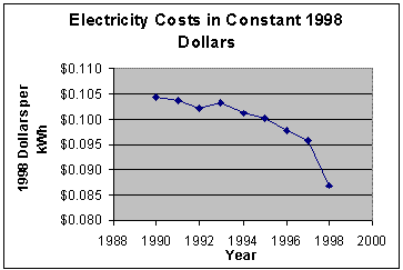
In fact, electricity costs went down every year except one from 1990 to 1998. In constant 1998 dollars, electricity costs were at their highest in 1990, when they were nearly 10.5¢ per kilowatt-hour. The cost dropped every year except 1993. The minimum was in 1998, at 8.7¢ per kilowatt-hour. The graph in constant dollars tells a very different (and more realistic) story of electricity costs. In general, most time series in involving money should be converted to constant dollars.
The inflation rate is defined to be the percentage increase in the CPI for a given year. For example, the CPI in 1997 was 160.5; in 1998 it was 163.0. The inflation rate for 1998 was
| (163.0 - 160.5) | = 1.6% |
160.5 |
A graph of the inflation rate over the last century tells a very interesting story:
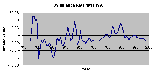
The inflation rate was positive for all but 12 of the 85 years. It peaked in 1918 at 18.0%. Its minimum was in 1921 at -10.5%. Inflation was highest overall during World War I (1914-1918). (Not coincidentally, the CPI was first published in 1919 partly as a response to the high inflation of the war years.) Inflation was low during the prosperous Twenties and was negative during the Great Depression. Inflation was high during World War II as well as immediately thereafter, reaching a local maximum of 14.4% in 1947. The Korean War was associated with another upspike in inflation, but inflation stayed moderate through the Fifties and early Sixties. During the Vietnam War, inflation rose again and became a national issue in the early Seventies. President Nixon attempted to freeze prices and wages with limited success. Inflation shot up twice in response to the two oil crises (1973-74) and (1979-80), peaking at 11.0% in 1974 and 13.5% in 1980. Inflation moderated during the Eighties but rose during during the Bush Administration, partly in response to the Persian Gulf War. Inflation has declined through the Nineties. In 1998, it was 1.6%, the lowest level in 35 years (since the early 1960's). The last time inflation was negative was 1955.
The CPI is widely used as a cost of living index, but technically it is not. The CPI measures the average change over time in the prices paid by urban consumers for a relatively fixed market basket of goods and services. A cost of living index would measure changes over time in the amount that consumers need to spend to reach a certain utility level or "standard of living." The CPI completely ignores important changes in taxes, health care, water and air quality, crime levels, consumer safety, and educational quality. Furthermore, the experience of any individual may vary dramatically from what the CPI indicates, because an individual's purchasing patterns may differ considerably from the standard market basket. Families with children have considerably different buying patterns than elderly households, for example. The CPI does not even attempt to represent the experience of people living in rural areas.
Even accepting these limitations of application, the CPI has some possibly serious limitations in measurement. The limitations fall into two broad categories.
Sampling errors
The CPI measures the prices of only a sample of items from a sample of outlets in a sample of cities. The items are chosen by the use of the Consumer Expenditure Survey (CES). The interview portion of the survey, conducted quarterly from 5000 households, collects data on expenditures, assets, liabilities, incomes, large item purchases and household expenses. The diary portion of the CES (also administered to 5000 households) asks each sample household to make a complete record of all expenses for a two-week period. Another survey, the Point of Purchase Survey (POPS), is used to determine which outlets are used for prices. The Point of Purchase Survey is administered 16,800 individuals each year. It determines how much consumers spend for different classes of items and also how much they spend at each of the places from which the items were bought. Even after one has chosen a sample of items and a sample of outlets, one much choose which particular models or brands will be priced and on which day of the month prices will be sampled. An attempt is made to represent sale days and nonsale days in their proper proportions. The cities are sampled as well; the largest cities are always included and an attempt is made to choose samples from cities of intermediate and small sizes. This complex stratified sampling has errors simply because one cannot record the price of every item purchased by every household in every urban area.
Non-sampling errors
More significant than sampling errors are possible sources of systematic error. Most of these errors are thought to bias the CPI upward, so that the CPI would tend to report more inflation than consumers are really experiencing.
Substitution bias
Substitution bias refers to the fact that consumers respond to price changes by substituting relatively cheaper goods for goods that have become more expensive. For example as the price of beef rises, families may substitute chicken for beef. The households' market baskets change (perhaps with no decline in utility) keeping expenditures down, but the CPI reports inflation of the original market basket. For example, suppose in one month the price of beef is $1 per pound and the price of chicken is $1 per pound, and that the household consumes 1 pound of each for a total expenditure of 2 pounds. Next suppose the next month the price of beef rises to $1.50 and the price of chicken remains the same. The fixed market basket would report an expenditure of $2.50 (1 pound of each again), a 25% inflation rate. In fact, the household may cut back to 0.5 pound of beef and 1.5 pounds of chicken with an expenditure of 0.5*1.50 + 1.5*1=$2.25, yielding a 12.5% inflation rate. Complicating matters is that utility of each situation may well be different.
Substitution bias can occur within item categories (e.g., consumers might substitute red delicious apples for granny smith apples when the price of granny smiths rise) and across item categories (e.g., consumers might substitute oranges for apples if the price of apples rises). The former is called lower level substitution bias, the latter high level substitution bias.
Formula Bias
Formula bias refers to a subtle problem relating to the fact that the initial quantities for items in the market basket were determined by dividing the current expenditure by the current average price. If the item happened to be on sale as of the point in time when they were first priced, that item would be systematically overweighted in the market basket and would bias the CPI upward because the prices of sale items tend to rise in subsequent months. The Bureau of Labor Statistics has developed a method called "seasoning" to adjust for this bias.
New Outlet Bias
The opening of a new discount outlet may give consumers the opportunity to purchase the same goods at a lower price. The current CPI ignores these price changes. To take the price changes totally into account would bias the CPI downward, since purchasing at discount stores tends to be accompanied with lower levels of service; discount stores tend to have less knowledgeable sales staff, less variety, less convenient store hours, less liberal return policies. However, some economists believe that ignoring outlet switching effects altogether biases the CPI upward because price differentials are not totally offset by differences in service quality, especially as discount stores have taken advantage of more efficient technologies of distribution. For example, Wal-Mart, a discount chain., has the most sophisticated distribution system of any retailer. That Wal-Mart has become the largest retailer in the US suggests that consumers do not consider the Wal-Mart's lower prices to be offset by inferior service.
Quality Change Bias
The Bureau of Labor Statistics does make an attempt to adjust for quality changes. If a product is 10% "better", and its price rises by 15%, the Bureau of Labor Statistics will attempt to record a price increase of approximately 5%. For example, median rent from 1976 to 1993 for all rental occupied units increased 2.92 times. The CPI rental index ratio for the same period was only 2.46. This difference means that the Bureau of Labor Statistics had factored in improvements in rental units at rate of approximately 1% per year. However, some economists believe that the Bureau of Labor Statistics systematically underestimates quality improvements, thereby biasing the CPI upward. For example in the case of rental units, from1970 to 1993 time period, the mean number of rooms in rental units increased by 9.7%; the mean number of rooms per person increased by 27%. The mean number of bathrooms increase by 23.3%. The fraction of all units containing central air conditioning increased from 10.8% to 41.7%. The number of rental units with dishwashers increased dramatically, and the quality of the refrigerators, stoves or oven/cooktop combinations, and garbage disposals increased considerably. Other categories whose quality improvements may not be completely factored in are apparel, new and used cars, and professional medical services.
New Product Bias
New products and new models of existing products tend to have a "product cycle." A typical new product is introduced at a relatively high price with low sales volume. Improvements in manufacturing techniques and higher sales volumes usually allow prices to be reduced and quality to improve. Later, when the product "matures," the price will tend to increase more rapidly than average. This pattern can be seen with many familiar products such as microwave ovens, VCR's, and cellular telephones. As with quality changes, the Bureau of Labor Statistics has methods to continually incorporate new products into the market basket, because the interval between the major revisions of the market basket (approximately ten years) is too long. However, there tends to be lag between introduction of a new product and its inclusion in the market basket, so that new products tend to be included later in their product cycles. The result is that the CPI might be biased upward.
Time of Month Bias
The Bureau of Labor Statistics does not collect prices on weekends and holidays when certain items are disproportionately put on sale in certain outlets. There is some evidence that the fraction of purchases made on weekends and holidays has increased as well. This effect would make the CPI less representative of the average consumer and bias it upward.
In 1996, the Senate Finance Committee appointed a advisory commission to study the consumer price index. Its chairman was Michael J. Boskin of Stanford University, and the report became widely known as the Boskin Report. The report recommended downward adjustments in the CPI of 1.1% broken down as follows:
| Estimates Of Biases In The CPI-Based
Measure Of The Cost Of Living (Percentage Points Per Annum) from the Boskin Report |
|
| Sources of Bias | Estimate |
| Upper Level Substitution | 0.15 |
| Lower Level Substitution | 0.25 |
| New Products/Quality Change | 0.60 |
| New Outlets | 0.10 |
| Total | 1.10 |
| Plausible range | (0.80-1.60) |
If the CPI is biased upward, it has numerous undesirable consequences. Many government programs have mandatory cost of living adjustments based on the CPI. The increases in the past would have been too high. Tax brackets are adjusted upward using the CPI; if the CPI is biased upward, tax brackets would have been adjusted too high, leading to less tax revenue. The higher payments and lower revenues would contribute to a higher national debt. An inaccurate CPI also gives citizens an incorrect view of the state of the US economy as well.
In these exercises, you may need the data in CPI.xls.
1. Using the price data in file Eggs.xls, add two columns: an Egg Price Index (1980=100) and an Egg Price Index (1990=100). Include the new table in your Word document. By what percentage did egg prices rise from 1980 to 1998? By what percentage did egg prices rise from 1993 to 1998?
2. Using the price data in file GasolinePrices.xls, add a column containing a Gasoline Price Index (1950=100). Include the new table in your Word document. By what percentage did gasoline prices decrease from 1950 to 1998? By what percentage did gasoline prices change from 1970 to 1982?
3. The Bureau of Labor Statistics price index for physicians' services (1982-84=100) for 1997 was 222.9. The price index for new cars (1982-84=100) for 1997 was 141.7.
a. Did prices for physicians' services or new cars rise more rapidly from 1982-4 to 1997? Why?
b. Did prices for physicians' services rise more rapidly than the general inflation rate? Did new car prices? Explain your reasoning.
c. The price index for housing (1990=100) in 1997 was 122.0. Did housing costs rise more rapidly than new car prices from 1997? What additional information would you need to answer this question?
4. The file PriceIndices.xls contains price indices for a wide variety of goods and services. In a well-written essay (approximately two type-written pages in length) describe a) overall price changes in the two periods 1980 to 1990 and 1990 to 1998 and b) the individual categories that experienced the greatest price changes both up and down during these two periods. Your essay should include some graphs made in Excel as well as an introductory paragraph and concluding paragraph.
5. Verify for yourself that the average of the CPI over the years 1982, 1983, 1984 really is 100.
6. In 1950 the median family income was $3,319, while the average Major League baseball player salary was $13,228. In 1998 the median household income was $38,885, while the average Major League baseball player was $1.4 million. Using constant 1998 dollars compare the salaries of baseball players and the average worker. Have baseball player salaries risen faster than the salaries of the average worker? In a short paragraph, speculate on the economic and cultural changes that have occurred from 1950 to 1998 that might help account for the discrepancy.
7. The Bureau of Labor Statistics has published official CPI figures back to 1913. How do we compare prices prior to that? Economic historians have attempted to construct indices for years before 1913, and the most commonly used index for historical purposes is McCusker's composite index which assembles the work of about one dozen economic historians. Using McCusker's index, compare 1900 prices and 1999 prices for the following items. Which items have increased the most? Which have decreased the most?
| Item | Price in 1900 | Price in 1999 |
| Sugar (1 lb.) | $0.04 | $0.78 |
| Eggs (1 dozen) | $0.14 | $1.79 |
| Butter (1 lb.) | $0.24 | $4.49 |
| Beef (1 lb.) | $0.07 | $2.29 |
| Coffee(1 lb. on commodity exchange) |
$0.07 | $1.35 |
| Kodak camera* | $5.00 | $120.00 |
| Lionel electric train | $6.00 | $150.00 |
| Train ticket** | $13.00 | $43.00 |
| First-class stamp | $0.02 | $0.33 |
| * Pocket Model D in 1900, Advanced Photo System in 1999 ** From St. Paul, MN to Minot, ND, on the Great Northern Railway/Amtrak Empire Builder Sources: The People's Chronology, Uncommon Grounds, Lionel LLC, Eastman Kodak Co., Amtrak, The Great Northern Railway-A History, The Traveller's Official Railway Guide, US Postal Service. Data published in Time, Dec. 31, 1999. |
8. In 1930, Babe Ruth received the then staggering annual salary of $80,000. In 1997-98, Michael Jordan received the still staggering annual salary of $33 million. Compare their salaries.Who really made more?
9. Using the data in the file ModelT.xls and CPI.xls, make a graph of the cost of a Model T Runabout in constant 1999 dollars. In a short well-written describe the graph. Can you guess when the assembly line was introduced?
10. Using the data in Titanic.xls, calculate the cost of tickets (berth, first, second, and third class) in 1999 constant dollars. Using the internet, find out how much a cruise across the Atlantic costs today and compare it the cost of the trip on the Titanic.
11. The table below lists the four highest paid athletes (excluding signing bonus and incentives) in four major US professional sports in 1988 and 1999. Convert the 1988 salaries to 1999 dollars and write a short paragraph comparing the salaries.
| Sport | Highest-paid players of 1988 |
Highest-paid players of 1999 |
|||
| Player, Team | Base Salary | Player, Team | Base Salary | ||
| NBA | Magic Johnson, L.A. Lakers | $3 million | Shaquille O'Neal, L.A. Lakers | $17.14 million | |
| MLB | Ozzie Smith, St. Louis Cardinals | $2.34 million | Pedro Martinez, Boston Red Sox | $11 million | |
| NFL | John Elway, Denver Broncos | $1.96 million | Troy Aikman, Dallas Cowboys | $5.87 million | |
| NHL | Wayne Gretzky, Edmonton Oilers | $0.9 million | Jaromir Jagr, Pittsburgh Penguins | $10.36 million | |
(Source: Chicago Tribune, Jan. 1, 2000, Section 3, Page 1.)
12. The table below shows the average ticket prices for four major US professional sports for the 1992-93 and 1999-2000 seasons.
| Sport | Average Ticket Price 1992-93 season |
Average Ticket Price 1999-2000 season |
| MLB | $9.57 | $14.91 |
| NBA | $25.16 | $48.37 |
| NHL | $25.96 | $45.70 |
| NFL | $27.19 | $45.63 |
a. Calculate the nominal percentage increase in ticket prices for each sport and include them in your Word document. Which sport had the greatest increase in prices? Which had the smallest?
b. Convert the 1992-93 ticket prices to 1999 dollars.
c. Find the percentage increase in ticket prices when they are expressed in 1999 dollars and include them in your Word document.. Have ticket prices significantly increased from 1992 to 1999?
13. As mentioned in the text, the Bureau of Labor Statistics actually publishes two CPI's, the CPI-U and CPI-W. Unions petitioned the federal government for the second index because they felt that the CPI-U did not reflect the experiences of workers (hence the "W"). The Bureau of Labor Statistics is currently experimenting with a new CPI's for elderly persons and for the poor. Do you think the Bureau of Labor Statistics should publish a CPI for the elderly and the poor? In a short well-written essay, state and justify your position. Your essay should be approximately 3/4 page in length. It should have an introduction, a conclusion, and reasoning to justify your position. Your essay should explore some of the political and economic implications of additional CPI's.
14. A traditional stereotype about the two dominant political parties in the US, the Democratic Party and the Republican Party, is that inflation is higher during Democratic presidencies. Using the data in CPI.xls, determine if this stereotype holds up from 1914 to 1998. Write a short (1 to 1.5 page) essay. In your essay, mention at least two complicating factors in making this analysis. For your convenience, the presidents and their party affiliation are listed below. Note that inauguration is in January except in unusual circumstances. For example, Warren Harding was president for most of 1921.
Years |
President |
Party |
1913-1921 |
Woodrow Wilson |
Democratic |
1921-1923 |
Warren Harding |
Republican |
1923-1929 |
Calvin Coolidge |
Republican |
1929-1933 |
Herbert Hoover |
Republican |
1933-1945 |
Franklin Roosevelt |
Democratic |
1945-1953 |
Harry Truman |
Democratic |
1953-1961 |
Dwight Eisenhower |
Republican |
1961-1963 |
John Kennedy |
Democratic |
1963-1969 |
Lyndon Johnson |
Democratic |
1969-1974 |
Richard Nixon |
Republican |
1974-1977 |
Gerald Ford |
Republican |
1977-1981 |
James Carter |
Democratic |
1981-1989 |
Ronald Reagan |
Republican |
1989-1993 |
George Bush |
Republican |
1993- |
Bill Clinton |
Democratic |
15. Economic historians often use the inflation rate as a measure of economic activity especially for the period prior to 1900, when gross domestic product figures are hard to obtain. Using the data in the files McCusker.xls and GDP.xls, determine the extent to which the percentage change in GDP and the inflation rate are correlated. In a well-written paragraph, present your conclusion and speculate why GDP growth and inflation might be associated with each other.
Bureau of Labor Statistics, U.S. Department of Labor, "Measurement Issues in the Consumer Price Index," June 6, 1997, http://stats.bls.gov/cpigm697.htm.
U.S. Senate, Committee on Finance, Final Report of the Advisory Commission to Study the Consumer Price Index. Print 104-72, 104 Congress, 2nd session, Washington, D.C.: Government Printing Office, 1996.
McCarthy, Philip J. "The Consumer Price Index" in Tanur, J., et al., Statistics: A Guide to the Unknown, Third Edition, Pacific Grove, CA: Wadsworth, 1989., pp. 198-207.
Moore, David S. Statistics: Concepts and Controversies. Fourth Ed. New York: W. H. Freeman and Company, 1997.