 |
Mathematical and Technological Literacy I |
|
|
|
Mathematical and Technological Literacy I |
|
Please do the following at the beginning of every computer activity.
a. Open a new Word document.
b. Click on the Office Button in the upper left corner, then slide over "Save As". Choose either "Word Document" to save your document as a Word 2007 document or "Word 97-2003 document" to save your document in an early version of Word. If you are not sure which to choose, you should use "Word 97-2003 document". Save the document to the desktop by setting the "Save in" textbox to "Desktop". (Saving to the desktop makes it easy to retrieve your work when you are finished.) Your file name should be entitled something like "Group Activity 4". Last, confirm the save as type in the last box. (*.docx) is the suffix for a Word 2007 document. (*.doc) is the suffix for early versions of Word.
Learning Goals for this Activity
Remember to create effective graphs using the techniques you learned in class (only hints are given to get you started on each graph/chart). For assistance, you may want to reference: Making Graphs in Excel 2007 and Graphing Checklist.
1. Open the file FatalWorkInjuries2009.xls, select tab titled, Fatal Work Injuries by Year, which contains the number of fatal work injuries and employment from 1992 through 2009. We are going to make a chart of this data and discuss the graph.
a. Make an XY scatterplot of the fatal work injuries data and be sure to choose the following graph type: Scatter with Straight Lines and Markers.
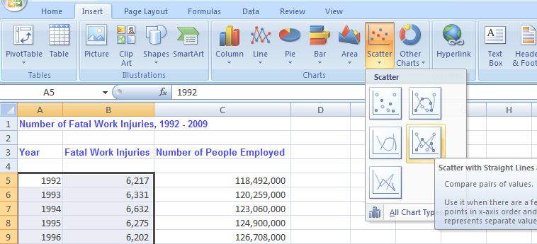
Paste your effective graph in your Word document.
b. Write 1-2 sentences carefully describing the graph. What do you want your audience to know about the data you graphed?
c. Change the scale on the y-axis (right click on the y-axis and choose Format Axis...). Start at with a minimum of 4000 (click on "fixed" then change the number from 0 to 4000) and end with a maximum of 7000 (no change needed). Include the graph in your Word document.
d. Is the graph you created in part a) better than the graph created in part c) or is the graph in part c) better? Which graph is correct? When would you choose to adjust the scale. Provide written support for your answer.
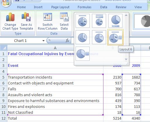
2. In the file, FatalWorkInjuries2009.xls, select tab titled, Fatal Injuries by Event. There are a few ways to represent this data One way is to make a pie chart of Fatal Occupational Injuries by Event or Exposure in 2009.
a. Create a pie chart of the 2009 data (columns A and C). To include the percentage data labels choose layout 6. It is also suggested that you choose style one (if you are printing on a black and white printer).
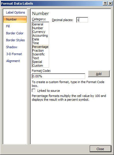
The data labels should show at least one decimal place. Right click on one of the data labels. Choose format Format Data Labels. Choose Number and Percentage (see below).
Make sure that you can see all the categories in your legend. Paste your effective chart in your Word document.
b. Write 1-2 sentences carefully describing the graph. What do you want you audience to know about the data you graphed?
c. Compare and contrast the pie chart you created in a to the pie chart below which was published by the Bureau of Labor and Statistics on page 4 (click on this link and use the scroll buttons at the bottom of the screen to locate page 4). What is the one major difference? Is the pie chart published by the Bureau of Labor and statistics correct? Hint: Count the main categories (ignore the subcategories on the Bureau of Labor graph). Explain.
3. In the file, FatalWorkInjuries2009.xls, select tab titled, Fatal Injuries by Gender.
a. Create 2 effective pie charts. One of employment by gender and the other of fatalities by gender. Paste both in your Word document.
b. Looking at the fatalities pie chart, which of the following conclusions is correct (choose one).
i. 93% of all men who are employed suffer a fatal injury.
ii. 7% of all women suffer a fatal injury.
iii. 7% of all fatal work injuries are suffered by women.c. Write 1-2 sentences carefully describing the two graphs. What can you conclude about employment and fatalities by gender?
4. In the file, FatalWorkInjuries2009.xls, select tab titled, Fatal Injuries by Age.
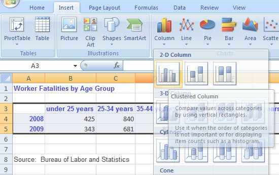
a. Make an effective column graph to represent the number of fatal work injuries for each age group in both 2008 and 2009. To make sure that each series is labeled, select the data beginning with cell A3 and ending with cell G5. Choose layout 9 to include the title, x and y axis labels and the legend. It is also suggested that you choose style one (if you are printing on a black and white printer). Paste your effective chart in your Word document.
b. What age group had the highest number of fatalities in 2009? Which group had the lowest number of fatalities in 2009? Which age group had the largest decrease in the number of fatalities from 2008 to 2009?
5. View the graph titled "Comparison of fatal work injury counts from 2003 to 2004 by age groups" in the following link: Bureau of Labor and Statistics Graph. Comment on at least one concern with this graph. (Hint: Compare the x-axis labels on this graph with the x-axis labels on the graph you created in question 4).) Explain why this might be a concern.
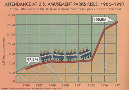
6. Critique the following graph, finding at least one serious misrepresentation. What misleading impression does it give?