 |
Mathematical and Technological Literacy I |
|
|
|
Mathematical and Technological Literacy I |
|
Please do the following at the beginning of every computer activity.
a. Open a new Word document.
b. Click on the Office Button in the upper left corner, then slide over "Save As". Choose either "Word Document" to save your document as a Word 2007 document or "Word 97-2003 document" to save your document in an early version of Word. If you are not sure which to choose, you should use "Word 97-2003 document". Save the document to the desktop by setting the "Save in" textbox to "Desktop". (Saving to the desktop makes it easy to retrieve your work when you are finished.) Your file name should be entitled something like "Group Activity 5". Last, confirm the save as type in the last box. (*.docx) is the suffix for a Word 2007 document. (*.doc) is the suffix for early versions of Word.
Activity
In this activity we will examine some data related to poverty in the US. Each year, the federal government sets a household income level threshold, below which a household qualifies for income assistance. This threshold is called the poverty level or poverty line. In 2010, the poverty level for a family of four was approximately $22,491 (http://www.census.gov/hhes/www/poverty/data/threshld/thresh10.xls).
a. Assuming that a family of four living at the poverty level includes only one adult who is working full time (40 hours a week, 50 weeks a year), how much is that person making per hour? Show your calculations.
b. Before proceeding to look at the data, briefly discuss among your group your speculations regarding: 1) approximately what percentage of the population as a whole is below the poverty line and 2) which states have the highest percentage of persons below the poverty level and which states have the least. In your Word document, write a paragraph responding to these two questions along with a brief explanation of your reasoning. We will be answering these two questions with official Census Bureau data later in this activity.
c. Open the file StatePoverty2009.xls, which contains Census Bureau estimates for the number of persons below the poverty level in 2008. Sort the data to determine which states have the most people below the poverty line. There are two ways to sort. The easiest way, which only works correctly if your data is contiguous, that is, not separated by blank columns or rows, is as follows: First click in the top cell (the first value, not the words) of the column you want to sort by. Then click on the Home Tab. Under the Editing Section choose Sort Z to A.

A second method of sorting that gives more fine-grained control over the process is as follows: Select all the data you would like to sort, except the header information. Typically this means selecting all the columns you are working with. Then click on the Home Tab. Under the Editing Section choose Custom Sort.
In your Word document, list the two states with the most people below the poverty line and in a sentence explain why we can't necessarily conclude that these two states are the poorest.
d. Fill column D with the percentage of the population that is below the
poverty level. (In D6 and D7 type a label "Percentage Below Poverty
Level". Then in cell D10, type =C10/B10. Then fill the rest of the
column. To fill, you can double click on the small box in the bottom right hand corner of
cell D10; alternately, you can left click on this small box, then holding the mouse button
down, move the mouse down to the end of the column. To express your values in
percent click on the percentage style button
![]() under the Home Tab in the Number Section. You may
express more decimals in your values by clicking a number of times on the "Increase
Decimal" button
under the Home Tab in the Number Section. You may
express more decimals in your values by clicking a number of times on the "Increase
Decimal" button
![]() ; to express fewer
decimals click on the "Decrease Decimal" button
; to express fewer
decimals click on the "Decrease Decimal" button
![]() . These buttons are also found in the
Number Section.
. These buttons are also found in the
Number Section.

e. Using Excel's column sorting tools, determine the three states that had the highest percentage of persons below the poverty level and which three states had the lowest percentage. In your Word document, write a short paragraph listing the names and percent below the poverty line for these states.
f. Calculate the percentage of all persons in the 50 states who are below the poverty
level and paste the result in your Word document. (You will need to add all the data
in columns B and C to do this. There are many ways to sum a column in Excel.
One way is to select with the mouse the data you would like to sum and then click
on
![]() . AutoSum is located under the
Home Tab in the Editing Section.)
. AutoSum is located under the
Home Tab in the Editing Section.)
g. Comparing the results of the questions in e and f to your group's speculations, how well did your group do? Were you surprised at all? Write a short response to this question in your Word document.
h. We will now make a shaded map of the poverty data. The first time you do this, you will need to follow these instructions carefully. Open the link http://qrc.depaul.edu/maptool. Select with the mouse the data in columns A and paste it into the Geographic Data column. Similarly, paste the data in column D into the other data column. This data is numerical and 4 classes is a fine level of shading for this map. Give the map a title, something like "Percent of People Living Below the Poverty Level by State in 2008'" Make your map and then paste your map into your Word document. The easiest way to copy and paste your map into your Word document is to right-click on it and choose the "Copy". Then go back to your Word document and paste as usual.
i. In a short well-written paragraph, describe the geographic patterns of poverty in the US. What regions have the highest levels of poverty? Which have the least? Are there some outliers? (An outlier is an unusual data point that goes against the general trend.)
j. Another map one could make of the data is below, which is a map of the data in columns A and C.
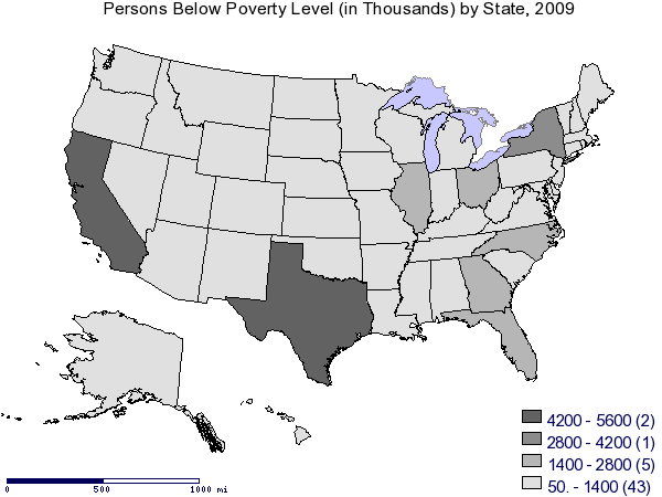
In a short well-written paragraph, explain why this map is not nearly as revealing as the map you made and why, for most analysis purposes, this map is not particularly useful.
Open the file SportsInjuries.xls, which contains recent data on the number of participants in some of the most common sports in the US and the number of injuries related to that sport. Sort the data according to the number of injuries. According to the sorted data, of all the sports, which has the highest and lowest number of injuries?
3. Can you conclude that a sport with a high number of injuries is dangerous? Why or why not?
4. Fill column D with the rate of number of injuries per participant. Unlike a percent, a ratio or rate is left in decimal form. Increase or decrease the number of decimal places so that the rate has 4 decimal places. Sort the data on column D. Of all the sports, which is the most and which is the least dangerous sports according to injury rate?
5. Look at bowling and explain what its rate means. It may be helpful to write the rate as a fraction.
6. Often, instead of per person (as a decimal point), rates are expressed as per 1000 people or per 100,000 people if the number divided by is very large. Use what you said in question 4 to convert the rates in column D to number of injuries per 10,000 participants. (In cell E7 type =D7*10000 then fill the rest of the column.) What is the rate per 10,000 for tennis?
7. In a well written paragraph explain the different views you obtain by sorting by the number of injuries and sorting by the injury rate. In your paragraph give an example of a sport whose ranking changes significantly when looking at absolute numbers and when looking at rates, and briefly explain how and why (mathematically speaking) the ranking of that sport changes.
8. Based on what we said in class about the differences among the types of relative quantities, why was a rate used in this activity and not a percent or ratio?