 |
Group Activity 6 |
|
|
|
Group Activity 6 |
|
All group activities must include a statement signed by all members of your group that each group member fully participated in the activity. Save it to the desktop and save frequently during the hour.
Learning Goals for this Activity
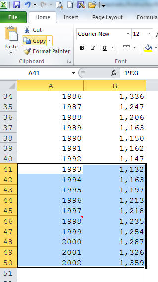
1. Open School enrollment 204.xls. We want to look at trends in Private School Enrollment - Grades 9-12. Using the techniques we learned in class or by referring to Techniques in Excel, eliminate all the "extra data" or copy and paste the required data into a clean worksheet. The data remaining should include the following columns:
Year
Private School Enrollment - Grades 9 -12
Remember to also omit any projected data points (2002 seems to be ok to use - be sure to edit the cell and remove the "/2"). Change years from text to numbers where applicable. (Please note that row number 55 is empty, as well as a few others, and the row height is adjusted so it can't be seen. Make sure your data ends with year 2002.)
2. Make a descriptive graph of the data and include the trendline, R-squared value and equation. Paste the graph in your Word document.
3. Is this equation a good fit for the data? Explain. Delete the trendline, equation and R-squared value from your graph.
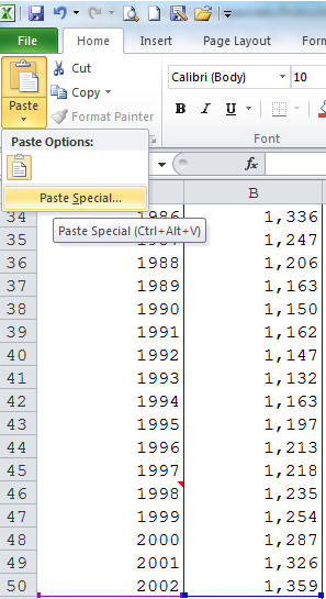
4. Add a localized trend to you graph. Highlight years 1993 through 2002 and the corresponding enrollment data and choose "Copy."
Click on the graph, go to the top of the dashboard and choose the Paste drop-down menu. Choose Paste Special:
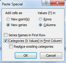
Choose the following:
There will be a new series of data overlaid on the end of the existing data series.
Now add a trendline to your new data (years 1993-2002 only) by right clicking on one of the new data points. Include the R-squared value and equation. Is the "new" equation a good fit for the data? Explain.

You must choose "Display Equation on Chart" and "Display R-squared value on chart" from the trendline options.

5. Calculate the projected private school enrollment for 2009 and type it in your Word document.
6. Below the last entry of 2002 in Excel, type 2009. In the cell next to 2009, type in your prediction for 2009. Now, using Copy and Paste Special as above (step 4), place your prediction on the graph. Remember to click on the graph between copying and using paste special, or you will not get the correct dialog box! Click to select "Categories (X values) in First Column."
Paste this graph in your Word document.
7. Write a paragraph stating your prediction along with statements supporting your model. The first sentence should clearly state your prediction and the years it was based on. The supporting statements should be informative and provide convincing evidence justifying your prediction. Remember to discuss the R-squared value and practical knowledge about the topic. Also discuss the number of data points used, outliers and shape of the graph (localized trends) when applicable. See Justifying your prediction in Words.
Turn in questions 1 - 7. The remainder of this activity will be completed in PowerPoint.
8. Open up PowerPoint and create a new slideshow. Insert a blank side from the dashboard (choose Home -> Slides -> New Slide) and delete the first, default title slide. Paste your finalized graph from question 6 into your new blank slide. Open another blank slide and insert the same graph on the second slide.
9. On the second slide, go to Insert -> Shapes and choose a block arrow shape. Draw the arrow on your graph pointing to your 2009 prediction.
10. Insert a third slide in PowerPoint. This slide (slide 3) should contain the names of the members in your group.
11. Animate the graph on slide one (the graph without the arrow).
a) Click on the "Animation" tab and choose custom animation. Select Add Effect followed by Entrance which can be found on the right side of the screen. Choose any of these entrance options. You can modify the speed and place of entrance here as well.
b) Click on the drop down box on the right side of your screen which should be titled "1 Content Placeholder" Choose Effect Options.
c) Next choose the Chart Animation tab. You will get a dialogue box that looks like:
Usually animating by series is what you want.
12. Try viewing your slide show. The original data will appear first, then the data with the trendline, followed by your prediction and the last thing to appear will be the "arrow" pointing to your prediction.
13. Add some color to your slides. Go to the "Design" tab and have some fun with themes and background colors.
14. Submit your mini-PowerPoint presentation in D2L Activity 6 dropbox to receive credit for questions 8-13.