Creating Graphs in Excel 2013
Creating Pie Charts
1. Select the data: To select the data for your graph (include all the values) click on the first cell of data and then drag your cursor over the remaining data to be included as part of the chart.
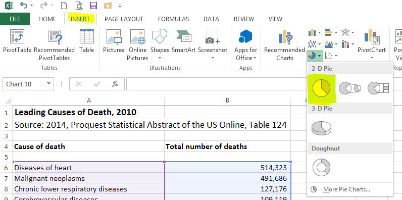
2. Choose a chart type: On the Insert tab of the Charts group select Pie. Under Pie, choose 2-D Pie (the first option). A simple graph is created.
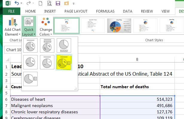
3. Choose a layout: You will need to add a title and data labels. First click on the graph to activate the Chart Tools menu and then choose the Design tab. Under the Charts Layout group, select #6. (Click on the "more" arrow to display all seven layouts. Slide over each layout until you locate #6.)
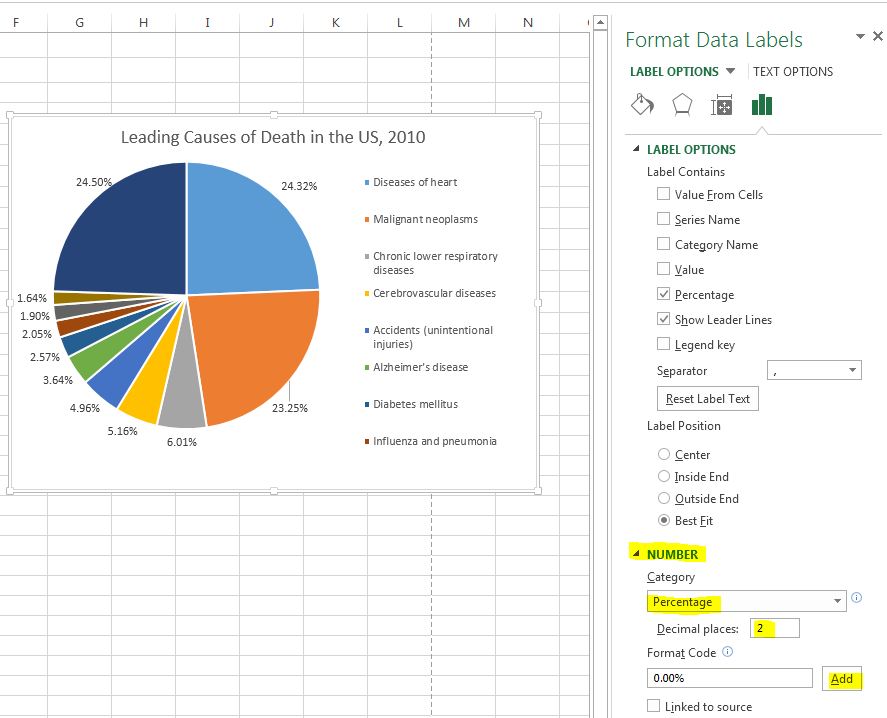
4. Update title and format percentages: Click on the Chart Title and add a descriptive title (consider who, what, where and when). It is suggested that you format the percents on the pie chart to two decimal places. Right-click on the the data labels (percentages), choose Format Data Labels.

In the Format Data Labels o nthe right hand box, expand the Number menu and then select Percentage. Change the number of decimal places to two (2).
5. Add the Source: It is important to add a text box stating the
data source used to create the graph. First CLICK ON YOUR GRAPH (If you do not
click on your graph, the subsequent steps will insert a text box in the
spreadsheet, not in your graph). After you click on your graph, under the Insert tab
choose text box under the Text group.
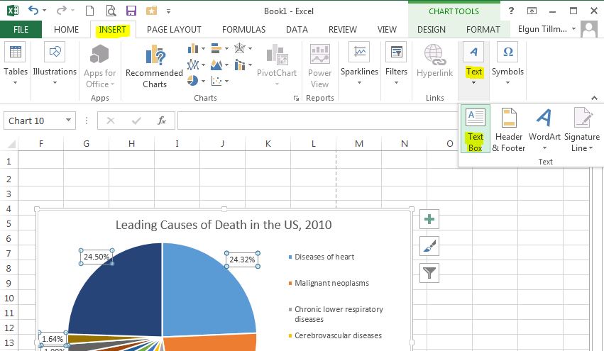
Draw a text box on your chart and then type in "Source:" followed by the data source. If no data source is listed, type "Unknown".

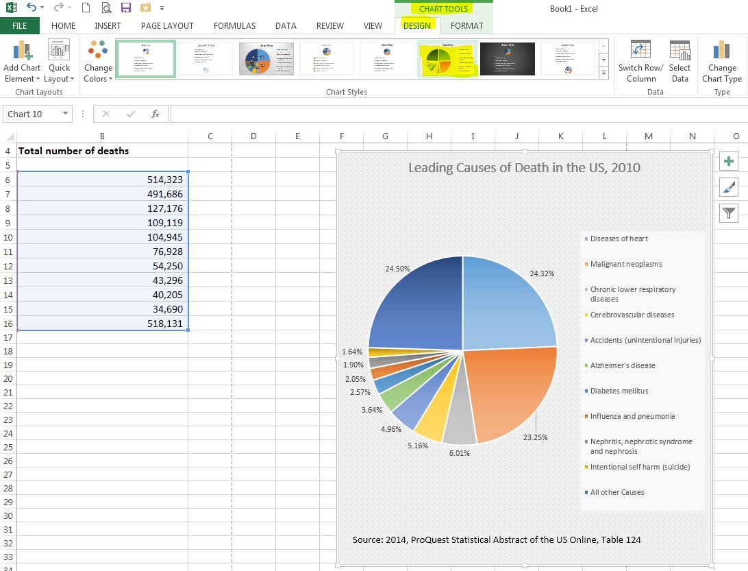
6. Additional changes: To make any additional changes to your graph, try right-clicking on the part of the graph that you would like to change. You may also want to try a different Design under the Chart tools --> Design tab. The graph below was created using the Style 6 design.
Creating Bar Charts
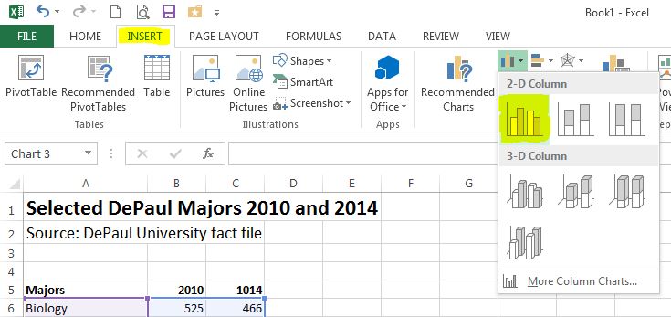
1. Select the data: To select the data for your graph click on the
first cell of data and then drag your cursor over the remaining data to be
included as part of the chart. If you are graphing more than one series,
select all the series.
2. Choose a chart type: On the Insert tab of the Charts group select Column. Under Column, choose 2-D Column (the first option on the left). A simple graph is created.
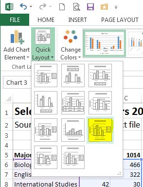
3. Choose
a layout: You will need to add
a title and axis labels. First click on the graph to activate the Chart
Tools menu and then choose the Design tab.
Under the Charts Layout group,
select Layout 9.
4. Update titles: Click on the Chart Title and add a descriptive title (consider who, what, where and when). Click on each Axis Title and label both your x-axis (horizontal axis) and your y-axis (vertical axis). If you are graphing only one series of data, always be certain to remove the legend (just click on the legend and use either the delete or backspace button).
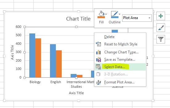
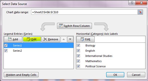
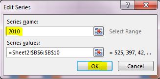
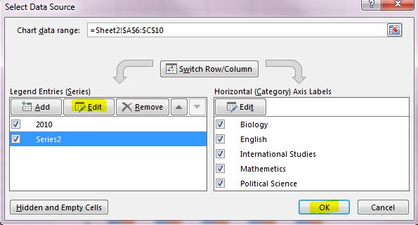
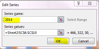
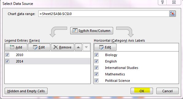
5. Naming each series in the legend: If you need to edit the names of your series (2010 and 2014 below) you can do so by first clicking on the graph to activate the Chart Tools menu. Under Chart Tools choose the Design tab, and under the Data group, select Select Data. The series are on the left side of the box. To edit the name of a series, highlight it and then click the Edit button. When the Edit Series box appears, type your series name in the box labeled Series Name.
6. Add the Source: It is
important to add a text box stating the data source used to create the graph.
First CLICK ON YOUR GRAPH (If you do not click on your graph, the subsequent
steps will insert a text box in the spreadsheet, not in your graph). After you
click on your graph, under the Insert tab
choose text box under the Text group. Draw
a text box on your chart and then type in "Source:" followed by the data source.
If no data source is listed, type "Unknown".
7. Additional changes: To make any additional changes to your graph, try right-clicking on the part of the graph that you would like to change. You may also want to try a different Design under the Chart tools --> Design tab. The graph below was created using the Style 6 design.

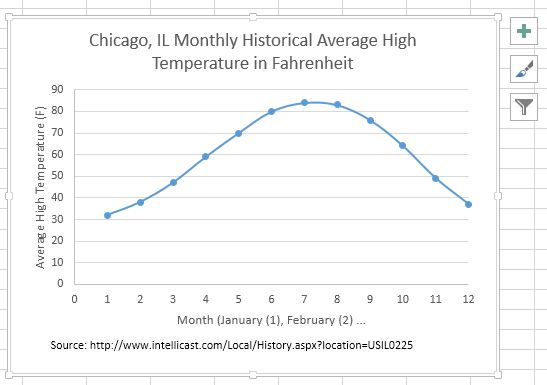
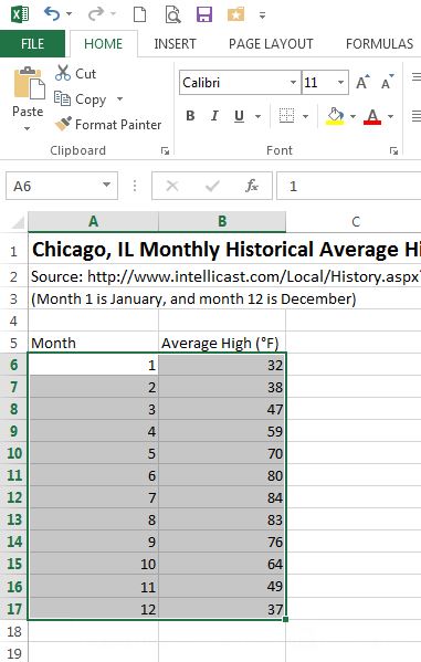
Creating Line Graphs
1. Select the data: To select the data for your graph, click on the first cell of data and then drag your cursor (it should be a thick cross) over the remaining data to be included as part of the chart.
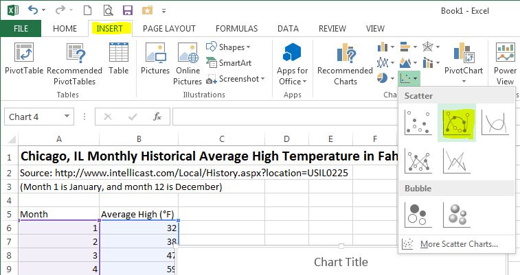
2. Choose a chart type: On the Insert tab of the Charts group select Scatter. Under Scatter, choose Scatter with Straight Lines and Markers (in the second row in the second column). A simple graph is created.
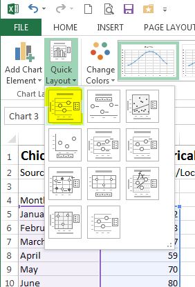
3. Choose a layout: You will need to add a title and axis labels. First click on the graph to activate the Chart Tools menu and then choose the Design tab. Under the Charts Layout group, select Layout 1.
4. Update titles: Click on the Chart Title and add a descriptive title (consider who, what, where and when). Click on each Axis Title and label both your x-axis (horizontal axis) and your y-axis (vertical axis). If you are graphing only one series of data, always be certain to remove the legend (just click on the legend and use either the delete or backspace button).
5. Naming each series in the legend (not needed with this example): If you need to edit the names of your series you can do so by first clicking on the graph to activate the Chart Tools menu. Under Chart Tools choose the Design tab, and under the Data group, select Select Data. The series are on the left side of the box. To edit the name of a series, highlight it and then click the Edit button. When the Edit Series box appears, type your series name in the box labeled Series Name.
6. Add the Source: It is
important to add a text box stating the data source used to create the graph.
First CLICK ON YOUR GRAPH (If you do not click on your graph, the subsequent
steps will insert a text box in the spreadsheet, not in your graph). After you
click on your graph, under the Insert tab
choose text box under the Text group. Draw
a text box on your chart and then type in "Source:" followed by the data source.
If no data source is listed, type "Unknown".
7. Additional changes: To make any additional changes to your graph, try right-clicking on the part of the graph that you would like to change. You may also want to try a different Design under the Chart tools --> Design tab. The graph below was created using the Style 40 design.