 |
Worksheet 2 |
|
|
|
Worksheet 2 |
|
1. When would you use the following types of graphs:
Pie Chart -
Bar Chart -
X Y Scatter (Line Graph) -
2. Open the file IL_Pop_By_Race.xls. Add a column which contains the percentage of total population for each racial category.
3. Make an effective graph using the above data.
a. What
is the purpose of making a graph from this data?
b. What type of graph should you make?
pie bar
x-y scatter (line)
c.
Decide on a title and consider the the W's (who, what, where and when)
d.
Legend: yes
no
e. Descriptive x-axis label (if applicable) -
f.
Descriptive y-axis label (if applicable) -
g.
Scale (if applicable) -
h.
Source -
4. Open the file
DePaulMajors04.xls. Make an effective graph
a. What
is the purpose of making a graph from this data?
b. What type of graph should you make?
pie bar
x-y scatter (line)
c.
Decide on a title and consider the the W's (who, what, where and when)
d.
Legend: yes
no
e. Descriptive x-axis label (if applicable) -
f.
Descriptive y-axis label (if applicable) -
g.
Scale (if applicable) -
h.
Source -
5. Open the file
ChicagoPopulation1830-2000.xls. Make an effective graph
a. What
is the purpose of making a graph from this data?
b. What type of graph should you make?
pie bar
x-y scatter (line)
c.
Decide on a title and consider the the W's (who, what, where and when)
d.
Legend: yes
no
e. Descriptive x-axis label (if applicable) -
f.
Descriptive y-axis label (if applicable) -
g.
Scale (if applicable) -
h.
Source -
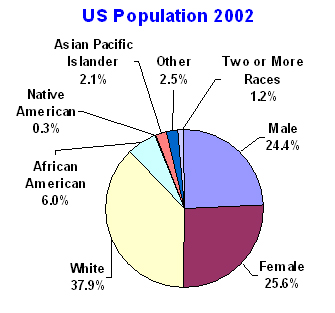
6. What's wrong with this chart?