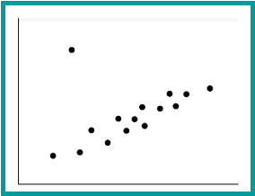
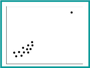
Picture One Picture Two
ISP 121
Activity 2 - Correlation
Please put your answers in a Word document.
1. Open the file StateSATS2004.xls which contains data on average SAT scores and the percent taking the SAT in each state in the US.
a. Sort the data to find which states have the highest average SAT scores and which have the lowest.
b. Make a scatterplot of the average score and the percentage of students taking the test. Add a linear trendline. Also calculate the correlation coefficient and add it to your graph. Paste the graph into your Word document.
c. Open CriticalValuesForR.xls. Is the relationship statistically significant?
d. Write a short paragraph describing the relationship between average SAT score and percentage student taking the test. Include a reasonable explanation for the type of correlation that is apparent.
e. How does Illinois compare in average SAT score? In percent taking the SAT? Make a conjecture why so few Illinois students take the SAT. How would go about testing your conjecture?
2. Open the file TVLifeExpectancy.xls, which contains data on life expectancy and the number of TV's per person in selected countries.
a. Make a scatterplot of the data; adjust the scale so that 40 is the minimum on the y-axis. Add a linear trendline. Also calculate the correlation coefficient and add it to your graph. Paste the graph into your Word document.
b. Open CriticalValuesForR.xls. Is the relationship statistically significant?
c. Describe the relationship between life expectancy and number of TV's per person.
d. Can we infer from the data that TV's promote (or cause) longevity? Can you name some common underlying causes for both longevity and higher rates of televisions per capita?
3. Open the file BreastCancerFatIntake.xls Researchers have shown that there is a positive correlation between the average fat intake and the breast cancer rate across countries. In other words, countries with higher fat intake tend to have higher breast cancer rates.
a. Using this dataset, determine which type of fat appears to have link to breast cancer? Justify your answer using what we learned in class.
b. Does this correlation prove that dietary fat is a contributing cause of breast cancer? Explain.
4. Use the following two pictures to speculate on what influence outliers have on correlation. For each picture, do you think the correlation is higher or lower than it would be without the outlier?
Picture One Picture Two
5. A strong correlation has been found in a certain city in the northeastern United States between weekly sales of hot chocolate and weekly sales of facial tissues. Would you interpret that to mean that hot chocolate causes people to need facial tissues? Explain.
6. If you were to draw a scatterplot of number of women in the work force versus number of Christmas trees sold in the United States for each year between 1930 and the present, you would find a very strong correlation.a. Why do you think this would be true?b. Does one cause the other?