 |
|
|
|
|
|
|
Converting to Constant Dollars
These questions require the use of CPI.xls. (Look at example1 in CPI Notes.htm.)
1. a) Your mother says that when she was a teenager in 1970 she babysat for neighbors and was paid $1.50 per hour. What is a comparable wage today (convert her wage to 2005 constant dollars to answer)?
b) Your grandfather says he paid 2 bits (50 cents) for a shoe shine in 1935. How much, in today's money, did he pay (convert the cost to 2005 constant dollars to answer)?
Comparing Prices
These questions require the use of CPI.xls. (Look at examples 2 and 3 in CPI Notes.htm.)
2. a) The average price of a gallon of gasoline (regular unleaded) in 1976 was $0.64. In 1998 it was $1.06. Was gas more expensive in 1976 or in1998? Convert the 1976 price to constant 1998 dollars and then compare it to the actual price in 1998 to answer. Show your work and explain your reasoning.
b) In 1989, red delicious apples cost on average $0.57 per pound. In 1998, they cost $0.94 per pound. Were apples more expensive in 1998 or in 1989?
c) In 1984, the price of ground beef was $1.29 per pound. In 1999, the price had risen to $1.45 per pound. Was ground beef more expensive in 1984 or in 1999?
Comparing Salaries
3. In 1948, the President of the United States earned a salary of $75,000. In 2000, the President earned a salary of $400,000. Using the information in CPI.xls, convert the 1948 salary to constant 2000 dollars. When comparing constant dollar amounts, whose salary was worth more--Harry Truman, President in 1948, or Bill Clinton, President in 2000? Show the work and explain your answer.
4. a) A worker was making a salary of $40,000 in 1999. His boss told him was getting a 3% raise in 2000. What was his 2000 salary?
b) Using the information in CPI.xls, what is his 1999 salary in 2000 constant dollars? According to this value and his actual 2000 salary, did he really get a worthwhile raise? Why or why not?
Minimum Wage
These questions require the use of the table CPI.xls. (Look at example 4 in CPI Notes.htm.)
5. Open the file MinWage.xls, which contains the minimum wage rate for the US starting in 1938 when it was instituted. An excellent source of information on the minimum wage in the United States is Department of Labor's page on the topic. (Please note that many states also have minimum wage laws. In cases where an employee is subject to both the state and federal minimum wage laws, the employee is entitled to the higher of the two minimum wages. The current minimum wage rate in Illinois is $6.50)
(a) Using the Chart Wizard, make a graph of this data and paste it into your Word document. You will find it easier if you choose an XY Scatter plot for this graph. Make sure you title the chart. Give the x and y axes appropriate labels.
(b) Can you make connections between which political parties and presidents were in power at various times and the patterns in the graph? Click here for the list of U.S. presidents. Does the data confirm or contradict popular stereotypes of the Republican and Democratic parties in the US?
(c) Is the graph you made in (a) an accurate portrayal of the buying power of the minimum wage? The answer is no but we can make a graph that does. To do so, we want to make a graph of the minimum wage rate in constant 2006 dollars. Open the file CPI.xls, a file that contains the consumer price index (CPI-U base year 1982-84) from 1913 to the present. Paste the CPI values from 1938 to 2007 in the column next to the minimum wage column in MinWage.xls. Add a column which contains the minimum wage in constant 2007 dollars. Make a new graph of the minimum wage in constant 2007 dollars (XY Scatter works best; remember you can select nonadjacent columns by holding down the Control key while you are selecting.) Paste your graph into your Word document.
(d) If you were earning the minimum wage, what year do you wish you were living in? Why?
(e) Look at years in your first graph when the actual minimum wage rate did not change (E.g. 1950-1955, 1981-89). Then look at the second graph and describe what happened to the minimum wage rate in constant dollars during those years. Explain why this pattern occurs.
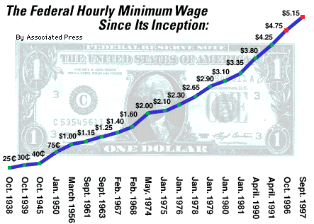
(f) The graph below was widely distributed in September of 1997 when the last minimum wage hike was instituted. While it is very attractive, the graph contains a serious error. Find the error and describe it. What impression does this graph give? How does the impression differ from the impression made by your first graph? How does it differ from the impression made by your second?
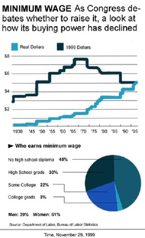
(g) This data seems to be difficult for the media to handle. Time Magazine on Nov. 29, 1999 published a graph of the very same data. It is also incorrect, although the error is not as grievous as the AP graph above. Find the error in the graph and describe it in your Word document. (Hint. It has to do with the constant dollars graph.)