 |
|
|
To get started, review your Stage One and Stage Two documents which have been returned with comments. Using this as a starting point, it is time to create you final project paper and presentation. Most, if not all, of the work should be incorporated into your final paper and presentation.
Due Date: July 16th
Final Paper Guidelines
Purpose: The basic task is to write a profile for the Chicago Tribune (or another publication) on a particular topic (school enrollment, men vs. women in college, rape, traffic fatalities, etc.)
Organization:
-
3-5 pages not including the graphs.
-
Graphs should be incorporated into the body of the text (not grouped together at the end).
-
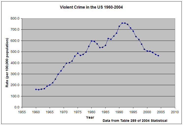
Each graph should have a subtitle or label on it, indicating the official table number from the Statistical Abstract that it was based on.
The paper should include:
-
a well-written introduction and conclusion
-
at least one trendline graph (preferably the trendline graph you created for your stage two document)
-
at least five graphs (You will have a total of 6 graphs including your trendline graph.)
-
a clear discussion of the data, making particular reference to the graphs (more below)
-
incorporation of a small amount of outside research (don't forget to cite your source(s))
-
an attempt to write in a style appropriate for your audience
How to talk about the graphs:
-
For ideas, visit the Chicago Tribune article (Chicago's Tolerance for Murder).
-
Think about the various activities you have done in class that have had you practice describing graphs (geographic trends, your faith in a trendline prediction, pie and bar/column graphs). This is your chance to put this knowledge to good and original use.
-
Use percentages, rates, and "times more/less than" statements as a way to draw comparisons between different figures (between highest and lowest points, between years, between men and women or different racial groups). Again, look at the Tribune to get some ideas.
-
Focus on what is interesting about the graphs, but don't exhaustively describe them. The graphs will do some of that work for you. You are the expert that will draw the reader's attention to what is interesting or important about a particular graph.
Your paper grade (25% of your final grade) will be based on four categories:
1. Mechanics (30 points)
At least 3 pages in length, excluding charts, graphs and maps
grammar and spelling
bibliographic references; in particular, refer to the tables you use on each graph/map. Include at least one additional source
introduction - what is my paper about?
conclusion - tie it all together
overall paper presentation
attached Stage 1 and Stage 2 with written comments
2. Trendline graph with prediction and written justification (20 points)
Is it central to my topic?
"effective" graph - use the guidelines we learned in class
added a localized trend if applicable
prediction is calculated correctly
written explanation provides at least two convincing justifications for the prediction (more if necessary)
3. Graphs including written explanation (30 points)
5 graphs/maps created from a minimum of 3 statistical abstract files
"effective" graphs - use the guidelines we learned in class
meaningful descriptions including the incorporation of percentage, rates, etc... when applicable
4. Overall Use of Quantitative Information (20 points)
shows an understanding of what we learned in class
appropriate applications of QR (i.e., converted to constant dollars)
appropriate representation of the data from Excel files
What to Submit:
1) A paper copy of your paper with a statement signed by all group members that all fully participated in the work.
2) Stage One and Stage Two
3) An electronic version of the paper. This can be submitted via email to tconnor@depaul.edu. Papers are archived as a precautionary measure.